

The
VIEW OUR TRAVEL PHOTO ALBUM >
Kate: Before and After
I thought this image would be interesting to share, in order to illustrate how one TINY change in the hue/saturation/luminance bar in Lightroom turned this image from being a hint too warm to pure magic. This photo is from a winter graduation shoot I did with Kate at Big Hill Springs Park west of Airdrie, a few weeks ago. It was pretty cold, so we would zip up her jacket and throw on some mittens as we walked between locations (err.. climbed.. scrambled.. or in my case, slipped my ass all over the ice in my cowboy boots! At one point on our descent I ended up scooting on my butt down the hill. Safer that way Haha). Then, once I picked a spot I liked, I would place Kate where I wanted her, run to where I want to shoot (because I love my 70-200 f/2.8 or my 85 to shoot with) and then shout for her to quickly peel off her jacket & mittens for a few quick shots, all the while shouting my directions at Kate. Thats how we get it DONE in Canada, son!
The EXIF data on this image is ISO 640 200mm f/2.8 1/160sec. There are a few things to note with the way I shot this photo. You wouldn’t know it, but I shot it in the dusky darkness under a huge pine tree, on the east side of a hill (when the sun was setting on the west side). So I had very little light to work with, except for the patch of snow in front of Kate’s right shoulder, which I used as a natural reflector to bounce light back onto her face. The background compression was worth the shade under the tree so I wanted to make it work. I pushed my ISO to 640, shot with a wide aperture of f/2.8, held my breath and shot at 1/160 with my 70-200 at 200mm (which is a no no because of camera shake) but hey, I pulled it off !
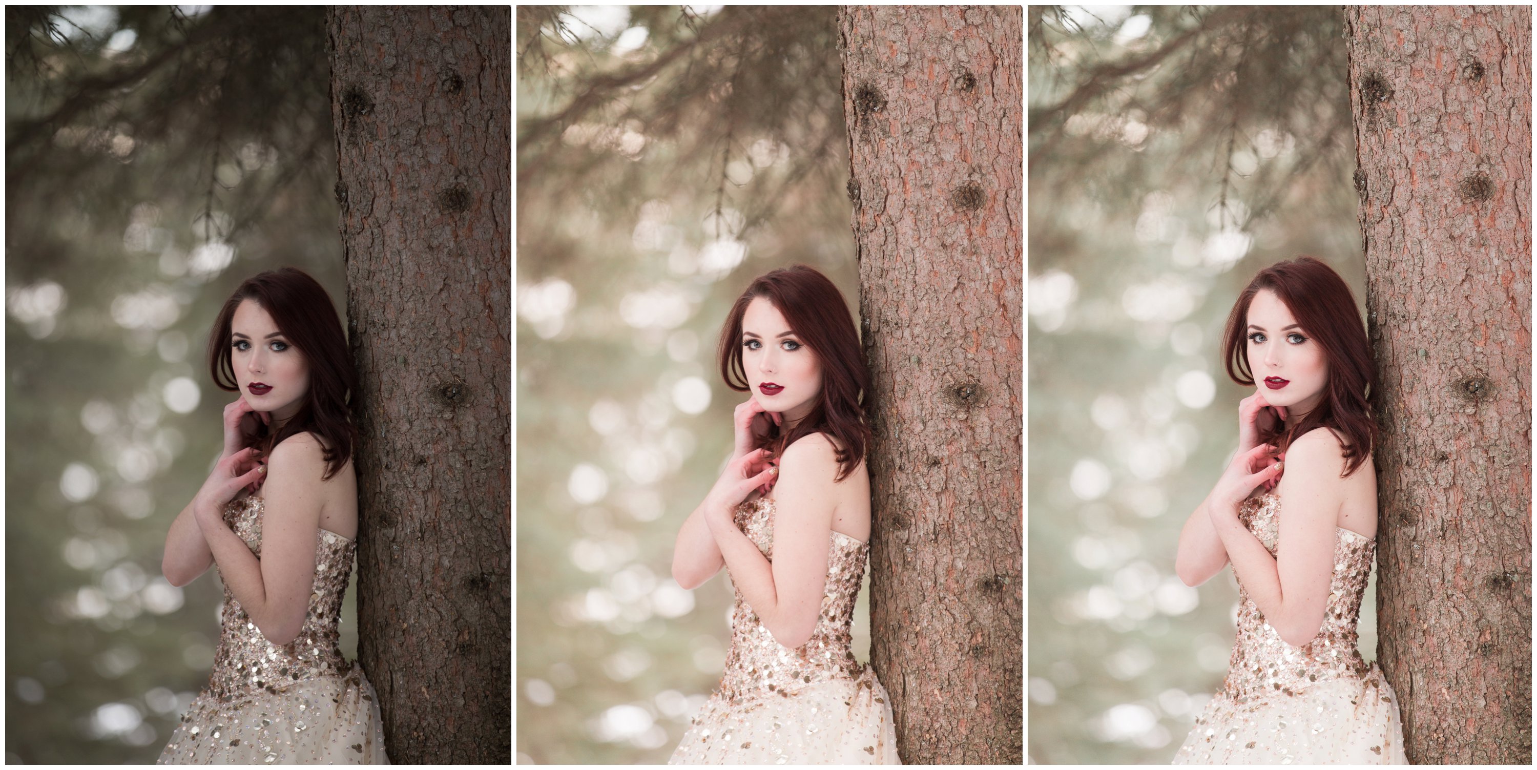
In Step 1, you can see the image straight out of camera (SOOC). You can see the dusky shadows and dead, grey skin tones that I will have to deal with in Lightroom. The blacks are super heavy and the image overall requires a bit of a pulse. A simple tweak to the basic panel to lift the shadows and reduce the blacks brought it to a happy place. A quick click to brighten the exposure and adding in some magenta put some nice color into her skin. But what was still bothering me about this image?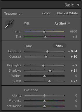
A little bit of diagnostic investigation lead me to pinpoint what was bothering me about this photo. Her skin tones do not change from Step 2 to Step 3, but it looks much more appropriate in Step 3. (ignore poor Kate’s frozen little fingers!). I am always so picky with skin tones because I would rather have someone look vibrant and alive then a tiny bit dull! I scanned and squinted at Step 2 multiple times trying to figure out what was bothering me — and then I finally got it. The colour yellow was predominant in Step 2, so I went to the Hue/Saturation/Luminance slider in Lightroom to adjust the HUE (range of colour) , SATURATION (amount of colour present) and my ol’ buddy LUMINANCE (making the colour heavier or lighter). BOOM. This tiny adjustment made the color of the pine tree scenery much more honest. 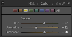
“But Kaycee (you implore), if you felt your image had too much yellow, WHY (que *bambi eyes*) wouldn’t you just use the temperature slider in your basic Lightroom panel?” Because my beef isn’t with the warmth, or not even the color yellow necessarily. It’s the TONE of the yellow that was bothering me, making the image feel murky. Feel free to comment any questions or if you thought this was helpful!
STAY TUNED FOR A KAYCEE ANN WORKSHOP COMING SOON!

Leave a Reply

@KAYCEEANNFARM
Visit the Barn

0
comments